Establishing a Grid Context
To define a CSS Grid we use display:grid or display:inline-grid on the parent element.
.container {
    display: grid;
}
This code snippet creates a new grid container. All direct children become grid items, and the auto-placement algorithm places them into the grid, creating new rows as needed.
Defining Columns and Rows
You can then create a grid using the grid-template-columns and grid-template-rows properties.
.container {
    display: grid;
    grid-template-columns: repeat(3, 1fr);
    grid-template-rows: 100px auto 100px;
}
The grid-template-columns and grid-template-rows define the columns and rows of the grid. Here, we have three columns each taking up 1 fraction of the available space, and three rows with heights of 100px, automatic, and 100px, respectively.
Gap Between Grid Items
The gap property defines the size of the gap between the rows and columns in a grid layout.
.container {
    display: grid;
    gap: 10px 20px; /* rows gap, columns gap */
}
The gap property is shorthand for row-gap and column-gap, and specifies the size of the gap between rows/columns.
Placing Grid Items
Grid items can be placed using grid-column-start, grid-column-end, grid-row-start, and grid-row-end. The span keyword specifies how many rows or columns an item will span.
.item {
    grid-column-start: 2;
    grid-column-end: span 3;
    grid-row-start: 1;
    grid-row-end: span 2;
}
Aligning Grid Items
The align-items and justify-items properties control how items are aligned inside their grid cells (along the block and inline directions).
.container {
    display: grid;
    align-items: center; /* vertical alignment */
    justify-items: start; /* horizontal alignment */
}
Grid Example
Now let’s put all of this together and see how it works.
HTML
<div class="container">
    <div class="box">1</div>
    <div class="box">2</div>
    <div class="box">3</div>
    <div class="box">4</div>
    <div class="box">5</div>
    <div class="box">6</div>
</div>
CSS
.container {
    display: grid;
    grid-template-columns: 120px 120px 120px;
    grid-gap: 15px;
    background-color: #fff;
    color: #999;
}

.box {
    padding: 15px;
    border-radius: 6px;
    background-color: #999;
    font-size: 36px;
    color: #fff;
}
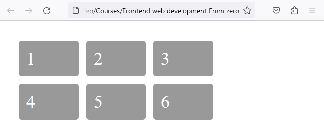
In this example, we set grid boxes to 120px each, using the grid-template-columns property. While the grid-gap property creates a gap between the columns and rows of 15px.
CSS Grid is a revolutionary tool in web design, allowing for precise, two-dimensional page layouts. Its power and versatility simplify what was once complex in website design, opening up a realm of creative opportunities.
Grid Template Areas
The grid-template-areas CSS property specifies named grid areas, establishing the cells in the grid and assigning them names.
This tool allows you to visually map out your web page layout with ease, creating a blueprint for where each element—like headers, footers, sidebars, and main content areas—will reside.
HTML
<div class="grid-container">
   <div class="header-item">Header</div>
   <div class="menu-item">Menu</div>
   <div class="main-item">Main</div>
   <div class="sidebar-item">Sidebar</div>
   <div class="footer-item">Footer</div>
</div>
CSS
.header-item { grid-area: header; }
.menu-item { grid-area: menu; }
.main-item { grid-area: main; }
.sidebar-item { grid-area: sidebar; }
.footer-item { grid-area: footer; }

.grid-container {
  display: grid;
  grid-template-areas:
    'header header header header header header'
    'menu main main main sidebar sidebar'
    'menu footer footer footer footer footer';
  gap: 10px;
  background-color: #2196F3;
  padding: 10px;
}
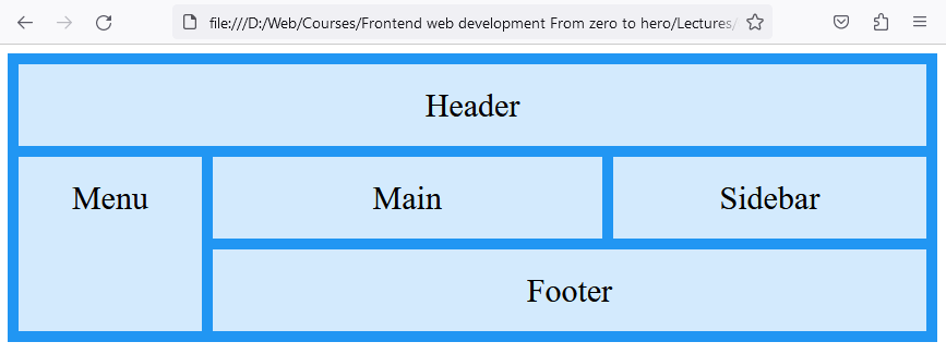
In this example, an entire layout for a website has been created in a relatively few lines of code.
It begins with an HTML structure comprising a div with class grid-container, containing five child divs representing different webpage sections: header, menu, main content, sidebar, and footer.
In CSS, each child div is assigned a grid-area name for positioning within the grid. The core of the lesson is the .grid-container class, where display: grid; activates the grid layout. The grid-template-areas property is crucial, defining a visual layout where different areas like the header, menu, main, sidebar, and footer are allocated specific positions and space on the webpage.
This example highlights the grid's flexibility in creating responsive designs, adaptable to various screen sizes. This example effectively demonstrates how CSS Grid Layout can be used for structured, responsive web design, showcasing the practicality and efficiency of grid layouts in web development.