What is Floating?
The CSS float property is used to push an element to the left or right, allowing other elements to wrap around it. It is commonly used with images but can be applied to almost any element.
Floating elements are taken out of the normal flow of a document and shifted to the left or right as far as they can go. Subsequent content will flow around the floated element.
Normally, block elements (like <div>, <p>, <section>) stack vertically, one under another. That default stacking behavior is called the normal document flow.
When you float an element, it stops behaving like a normal block in the layout and instead “slides” to the left or right, allowing text and inline content to wrap around it.
Using the Float Property
The float property can have one of the following values:
- left: The element floats to the left of its container.
- right: The element floats to the right of its container.
- none: The element does not float (default value).
- inherit: The element inherits the float value of its parent.
Let's create a simple example where we float an image to the left, and the text wraps around the image:
HTML
<div class="article">
  <img class="article-image" src="image1.jpg" alt="My Image" width="200" />
  <p>
    Lorem ipsum dolor sit amet, consectetur adipiscing elit. Phasellus hendrerit...
  </p>
  <div class="clear"></div>
</div>
CSS
.article {
  width: 400px;
}

.article-image {
  float: left;
  margin-right: 10px; /* margin is better here than padding */
}

.clear {
  clear: both;
}
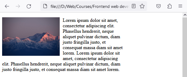
In the example above, the image will float to the left, and the paragraph text will wrap around it. At the end of the code we use clear: both to ensure the layout of the document doesn’t break. This forces the next content to appear below the floated element instead of wrapping around it.
Yoiu might be wondering why I didn't use padding-right here to separate the iamge and the text. Padding increases the space inside the image element’s box, while margin creates space outside the image, which is exactly what we want when pushing text away.
Clearing Floats
When you use the float property, you may encounter issues where elements overlap or layout is broken.
A floated element is still visible, but it no longer contributes to the height of its parent container. That means the parent can collapse to height 0, and the next element may slide upward into places where it doesn’t belong.
This is why floats often feel “unpredictable” until you learn how clearing works.
The clear property specifies what elements can float beside the cleared element and on which side. Here are the possible values:
- none: Allows floating elements on both sides.
- left: No floating elements allowed on the left side.
- right: No floating elements allowed on the right side.
- both: No floating elements allowed on either side.
- inherit: The element inherits the clear value from its parent.
Example of how floating elements can break the document layout:
<!DOCTYPE html>
<html>
<head>
  <style>
    .column-1{
        width: 33%;
        float: left;
        height: 100px;
        border: 1px solid;
        box-sizing: border-box;
    }

    .column-2 {
        width: 33%;
        float: right;
        height: 100px;
        border: 1px solid;
        box-sizing: border-box;
    }

    .column-3 {
        width: 100%;
        height: 100px;
        border: 1px solid;
        box-sizing: border-box;
    }
  </style>
</head>
<body>
    <div class="container">
        <div class="column-1">Column 1</div>
        <div class="column-2">Column 2</div>
    </div>
    <div class="column-3">Column 3</div>
</body>
</html>
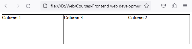
In this example, the layout has broken. If you check the code you will see that the element .column-3 is supposed to be after the div with the class .container, but instead .column-3 has moved in between the elements .column-1 and .column-2.
To restore the document flow, we need to use the clear property. In the following example we introduced a new class .clearfix with the rule clear: both and added an element with the class after the last floated element, which is .column-2 in this case.
CSS
.clearfix {
    clear: both;
}
HTML
<body>
    <div class="container">
        <div class="column-1">Column 1</div>
        <div class="column-2">Column 2</div>
        <div class="clearfix"></div>
    </div>
    <div class="column-3">Column 3</div>
</body>
What will happen is the following:
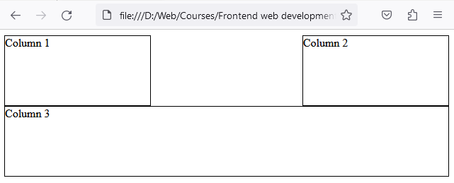
As you can see in the image, the flow has been restored, and .column-3 is now where it should be in the natural document flow.
The Modern Clearfix (Recommended)
The .clearfix div solution works, but it’s outdated and adds extra HTML purely for layout. Instead of inserting an empty <div class="clearfix"></div>, we can clear floats using CSS only.
CSS
.clearfix::after {
  content: "";
  display: block;
  clear: both;
}
HTML
<div class="container clearfix">
  <div class="column-1">Column 1</div>
  <div class="column-2">Column 2</div>
</div>

<div class="column-3">Column 3</div>
Why this is better
This keeps your HTML clean and semantic. Your layout behavior stays in CSS where it belongs.
Using CSS Overflow to clear floats
The overflow property with the value hidden can also be used to clear floats, if you apply it to the parent element of a floated element like in the example below.
HTML
<div class="container">
  <div class="column">Column 1</div>
  <div class="column">Column 2</div>
  <div class="column">Column 3</div>
</div>
CSS
.container {
    width: 100%;
    height: 200px;
    overflow: auto; /* This will clear the floats for the child elements */
}
.column {
    width: 33%;
    float: left;
    height: 200px;
}
The overflow: hidden also clears floats, but it can clip shadows, dropdowns, and content that extends outside the container. Be careful when using overflow: hidden; because it will hide everything which is outside the element's dimensions.
When should I use float today?
When to Use Float Today
Float is still useful, but mostly for its original purpose:
- Wrapping text around images
- Small UI tricks (rare)
- Supporting old legacy layouts
For building full layouts today, you’ll almost always use:
- Flexbox for one-dimensional layouts (row OR column)
- Grid for two-dimensional layouts (rows AND columns)
So learn floats to understand older code and to handle text-wrap cases — but don’t use floats as your main layout system.
Common Beginner Mistakes with Float
- Forgetting to clear floats (parent collapses)
- Using float for entire layouts instead of Flexbox/Grid
- Mixing floats with random margins until it “looks right”
- Using overflow: hidden and accidentally clipping content.
- Expecting floated elements to behave like Flexbox columns