What is Bootstrap?
Bootstrap is a free and open-source CSS framework directed at responsive, mobile-first front-end web development. It contains CSS and JavaScript-based design templates for typography, forms, buttons, navigation, and other interface components.
When to use Bootstrap?
- Use Bootstrap when you want speed + consistency (admin panels, landing pages, dashboards, prototypes).
- Avoid (or heavily customize) if you need a highly unique design system and want full control from scratch.
Setting up Bootstrap
There are several ways to include Bootstrap in your project:
Via CDN (Content Delivery Network):
Simply add the following links in the <head> section of your HTML document.
<!DOCTYPE html>
<html lang="en">
  <head>
    <meta charset="utf-8">
    <meta name="viewport" content="width=device-width, initial-scale=1">
    <title>Bootstrap demo</title>
    <link
        href="https://cdn.jsdelivr.net/npm/bootstrap@5.3.2/dist/css/bootstrap.min.css"
        rel="stylesheet">
  </head>

  <body>
    <h1>Hello, world!</h1>
    <script
    src="https://cdn.jsdelivr.net/npm/bootstrap@5.3.2/dist/js/bootstrap.bundle.min.js">
    </script>
  </body>
</html>
Local Installation:
- You can download Bootstrap from the official website https://getbootstrap.com/.
- Use package managers like npm with npm install bootstrap.
Bootstrap Grid System
Bootstrap uses a 12-column responsive grid system. This helps developers create page layouts for different screen sizes.
<div class="container">
    <div class="row">
      <div class="col-sm">Column 1</div>
      <div class="col-sm">Column 2</div>
      <div class="col-sm">Column 3</div>
    </div>
</div>
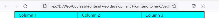
In this example, we have a row with 3 columns inside of a Bootstrap container.
- .container: Fixed-width container.
- .container-fluid: Full-width container that spans the entire viewport.
- .row: Creates a row of columns.
- .col-{breakpoint}: Specifies column width for different screen sizes (xs, sm, md, lg, xl).
- .col-{breakpoint}-{col-span}: Specifies column width for different screen sizes (xs, sm, md, lg, xl) and column spans (1, 2, 3, 4, 5, 6, 7, 8, 9, 10, 11, 12).
<div class="container">
    <div class="row">
      <div class="col-12 col-sm-6 col-md-4">Column 1</div>
      <div class="col-12 col-sm-6 col-md-4">Column 2</div>
      <div class="col-12 col-sm-6 col-md-4">Column 3</div>
    </div>
</div>
In this example, we again have a row with 3 columns inside of a container, but this time they are fine tuned to take up the full width of the viewport on mobile extra small (xs) devices, half width on small (sm) devices and three per row on medium (md) and larger devices.
Bootstrap Breakpoints
Bootstrap includes six default breakpoints, sometimes referred to as grid tiers, for building responsively. These breakpoints can be customized if you’re using our source Sass files.
|
Breakpoint |
Class infix |
Dimensions |
|---|---|---|
|
Extra small |
None |
<576px |
|
Small |
sm |
≥576px |
|
Medium |
md |
≥768px |
|
Large |
lg |
≥992px |
|
Extra large |
xl |
≥1200px |
|
Extra extra large |
xxl |
≥1400px |
Each breakpoint was chosen to comfortably hold containers whose widths are multiples of 12. Breakpoints are also representative of a subset of common device sizes and viewport dimensions, they don’t specifically target every use case or device. Instead, the ranges provide a strong and consistent foundation to build on for nearly any device.
Core Components
Bootstrap comes with numerous predefined components:
- Navigation: Navbar, Breadcrumbs, Pagination, etc.
- Content: Typography, Images, Tables, etc.
- Forms: Inputs, Textareas, Buttons, Checkboxes, Radios, etc.
- Components: Alerts, Badges, Dropdowns, Modal, Progress bars, Spinners, etc.
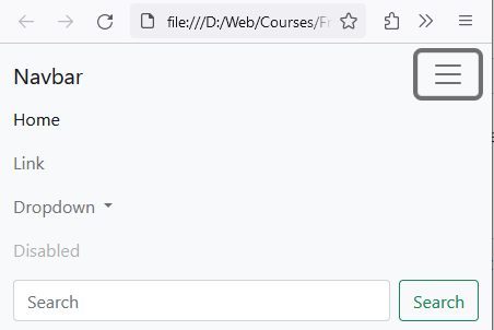
Example:
<nav class="navbar navbar-expand-lg navbar-light bg-light">
   <div class="container-fluid">
      <a class="navbar-brand" href="#">Navbar</a>
      <button class="navbar-toggler"
            type="button"
            data-bs-toggle="collapse"
            data-bs-target="#navbarSupportedContent"
            aria-controls="navbarSupportedContent"
            aria-expanded="false"
            aria-label="Toggle navigation">
         <span class="navbar-toggler-icon"></span>
      </button>
      <div class="collapse navbar-collapse" id="navbarSupportedContent">
         <ul class="navbar-nav me-auto mb-2 mb-lg-0">
            <li class="nav-item">
               <a class="nav-link active" aria-current="page" href="#">Home</a>
            </li>
            <li class="nav-item">
               <a class="nav-link" href="#">Link</a>
            </li>
            <li class="nav-item dropdown">
               <a class="nav-link dropdown-toggle"
                  href="#"
                  id="navbarDropdown"
                  role="button"
                  data-bs-toggle="dropdown"
                  aria-expanded="false">
                  Dropdown
               </a>
               <ul class="dropdown-menu" aria-labelledby="navbarDropdown">
                  <li><a class="dropdown-item" href="#">Action</a></li>
                  <li><a class="dropdown-item" href="#">Another action</a></li>
                  <li><hr class="dropdown-divider"></li>
                  <li><a class="dropdown-item" href="#">Something else here</a></li>
               </ul>
            </li>
            <li class="nav-item">
               <a class="nav-link disabled"
        href="#"
        tabindex="-1"
        aria-disabled="true">Disabled</a>
            </li>
         </ul>
         <form class="d-flex">
            <input class="form-control me-2"
        type="search" placeholder="Search" aria-label="Search">
            <button class="btn btn-outline-success" type="submit">Search</button>
         </form>
      </div>
   </div>
</nav>
Desktop:

Mobile:
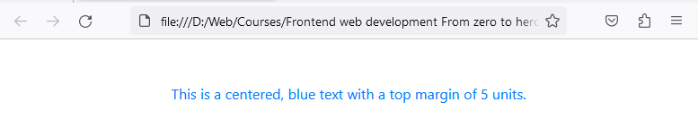
Utilities
Bootstrap offers utility classes for:
- Borders
- Colors
- Display
- Spacing (Margin & Padding)
- Text alignment and more.
Example:
<p class="text-center text-primary mt-5">
     This is a centered, blue text with a top margin of 5 units.
</p>
You can learn more about all the components Bootstrap has to offer here: https://getbootstrap.com/docs/5.3/getting-started/introduction/
Practice Task
Practice: Build a responsive layout
- Create a .container
- Add a .row with g-3 spacing
- Add 6 boxes using col-12 col-md-6 col-lg-4
- Add p-3 border rounded utilities to each box
- Make headings centered on mobile only: text-center text-md-start