One Column Layouts
A one column layout, often called a "single-column" or "full-width" layout, is a simplistic, straightforward structure. This is most suitable for mobile sites, minimalistic websites, blogs, or lengthy content pages.
Features:
- Focused content delivery.
- Ease of navigation.
- Superb for readability.
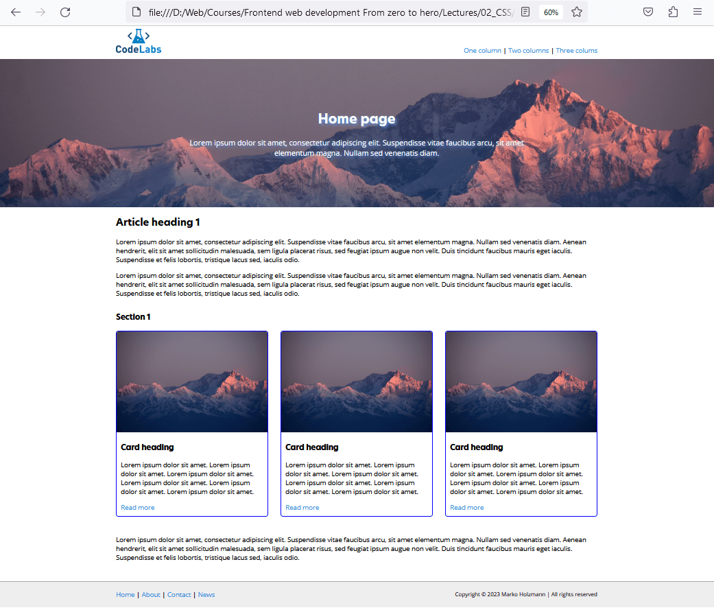
Tip: One-column layouts are naturally responsive because content stacks vertically. They’re ideal when reading flow matters (articles, documentation, landing pages) and when you want users to focus on one primary message.
Two Column Layouts
A two column layout, a staple for many websites, typically presents main content alongside a sidebar. It's a prevalent choice for blogs, news sites, and content-rich portals.
Features:
- Distinct content separation.
- Incorporate secondary content or navigation elements.
- Dynamic content presentation.
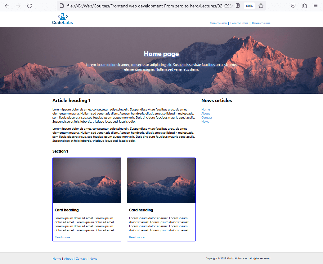
Tip: Two-column layouts usually place the most important content in the wider column and supporting content in the sidebar (categories, newsletter, related posts). On smaller screens, the sidebar often moves below the main content.
Three Column Layouts
The three column layout, showcasing content sandwiched between two sidebars, is ideal for sites necessitating numerous navigation links, ads, or additional info like quick facts, related reads, etc.
Features:
- Greater content segmentation.
- Ample space for diverse content types.
- Perfect for content-rich sites requiring multiple navigation or information panels.
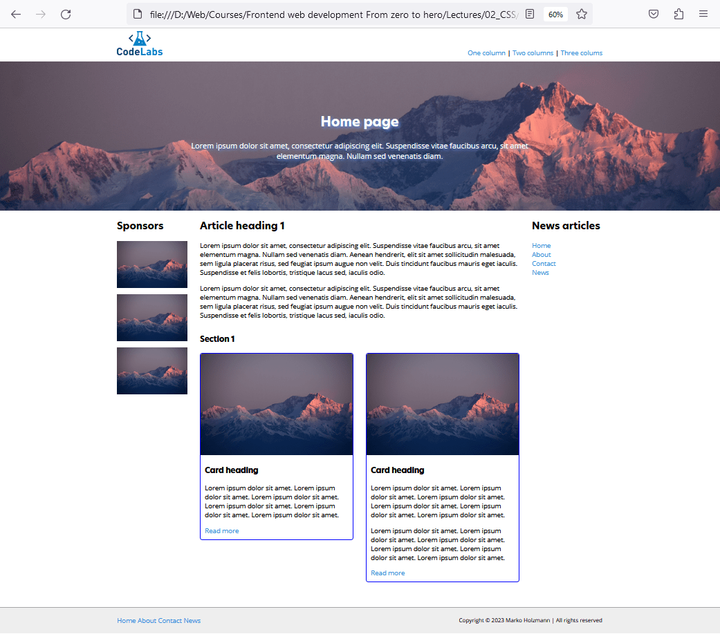
Tip: Three-column layouts can feel busy, so they work best when you truly need two supporting areas (navigation + ads, filters + extra info). For mobile, these layouts almost always collapse into a single column.